


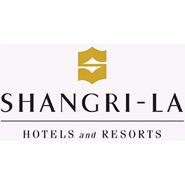
 As part of Shangri-La’s 50th anniversary celebrations, the group has announced a refreshed brand logo for Shangri-La Hotels and Resorts.
The new logo pays tribute to the brand’s past and sets a fresh vision for the future. It reflects the brand’s journey and evolution with its guests while staying true to the roots that have continually delivered warm Asian hospitality.
The refreshed Shangri-La logo presents a more contemporary look and feel while maintaining the powerful equity of the brand. The signature S mark is retained and takes on a new gold color that evokes the warm glow of sunrise. The original typeface is refined for a more modern feel to align with the new design ethos and is inspired by Asian calligraphic elements which create a connection to history and tradition. In addition, the brand has opted not to include Hotels and Resorts in the refreshed logo, recognizing that Shangri-La is more than a place; it is a feeling and an experience that inspires personal moments of joy.
Having opened its first hotel in Singapore in 1971, Shangri-La’s story has been closely tied to Asia for 50 years. The brand has expanded to key destinations around the world, boasting more than 80 hotels and resorts that bring the best of Asia through heartfelt hospitality and joyful experiences.